Total Pageviews

Showing posts with label nodejs. Show all posts

Sunday, 26 July 2026

web-page-editor

 web 页面编辑器,前端”低代码“,通过拖拽的方式生成web页面.


web-page-editor

基于 React 实现的 web 页面编辑器

项目初始化

基于 pnpm 的 monorepo 的代码管理

在项目目录执行


pnpm init


在项目根目录新建 pnpm-workspace.yaml 文件,添加如下内容


packages:

  • 'apps/*'

定义开发规范

代码规范检查与修复

  • 代码规范,eslint 工具

执行安装: -D:指定为开发依赖 -w:在根目录空间安装依赖


pnpm i eslint -D -w


初始化 eslint 配置,执行


npx eslint --init


勾选相应配置项, 由于使用 momorepo. 配置安装可能可能会报错,需要手动安装 例如:


pnpm i @typescript-eslint/eslint-plugin @typescript-eslint/parser -D -w


代码风格格式化 prettier

  1. 安装

pnpm i prettier -D -w


  1. 根目录新建配置文件 .prettierrc.json,添加自己的喜好配置

{ "printWidth": 80, "tabWidth": 2, "useTabs": true, "singleQuote": true, "semi": true, "trailingComma": "none", "bracketSpacing": true }


  1. 由于 eslint 也有代码风格检查,为避免与 eslint 代码风格检查冲突,将 prettier 检查集成至 eslint

安装集成插件


pnpm i eslint-config-prettier eslint-plugin-prettier -D -w


然后在 eslint 配置文件中的相应字段添加插件配置


{ "extends": [ "prettier", "plugin:prettier/recommended" ],

"plugins": [ "prettier" ], }


在 package.json 添加代码检查脚本命令


"scripts": {
...,
	+ "lint": "eslint --ext .ts,.jsx,.tsx --fix --quiet ./packages",
},

代码提交规范

  1. 安装 husky 用于拦截 commit 命令

pnpm i husky -D -w


  1. 初始化 husky (前提是项目与仓库已建立关联)

npx husky install


3, 添加 husky 执行脚本


npx husky add .husky/pre-commit "pnpm lint"


将构建 husky/pre-commit 文件,并将脚本命令 pnpm lint 添加到其中

  1. 添加 lint-staged

TODO: pnpm lint 会对代码进行全量检查,通过 lint-staged 可配置只对修改的代码进行提交检查

  1. 添加提交信息规范检查

安装插件


pnpm i commitlint @commitlint/cli @commitlint/config-conventional -D -w


在根目录新建 .commitlintrc.js 配置文件,添加如下内容指定提交规范集为 @commitlint/config-conventional


module.exports = { extends: ['@commitlint/config-conventional'] };


将 commitlint 集成到 husky 中


npx husky add .husky/commit-msg "npx --no-install commitlint -e $HUSKY_GIT_PARAMS"


规范集 conventional


// 提交的类型:摘要信息 :


常见的提交类型:

  • feat:添加新功能
  • fix: 修复bug
  • chore: 一些不影响功能的修改
  • docs: 专指文档的修改
  • perf: 性能方面的优化
  • refactor: 代码重构
  • test: 添加一些测试代码

from  https://github.com/MutongXiao/web-page-editor

( https://github.com/brightmann/web-page-editor)

Saturday, 25 July 2026

WebChat, 跟访问同一网站的人聊天

 Chat with anyone on any website.

 https://chromewebstore.google.com/detail/webchat/cpaedhbidlpnbdfegakhiamfpndhjpgf

CI GitHub License Chrome Web Store Version GitHub Release Ask DeepWiki

Chat with anyone on any website

This is an anonymous chat browser extension that is decentralized and serverless, utilizing WebRTC for end-to-end encrypted communication. It prioritizes privacy, with all data stored locally.

The aim is to add chat room functionality to any website, you'll never feel alone again.

Install

Install from Store

Manual Installation

  1. Go to the GitHub repository (Releases)
  2. Click on the "Assets" button and select "web-chat-*.zip"
  3. Extract the ZIP file to a folder on your computer
  4. Open the extension management page in your browser (usually chrome://extensions/)
    • Enable "Developer mode"
    • Click "Load unpacked" and select the folder you just extracted

Usage

After installing the extension, you'll see a ghost icon in the bottom-right corner of any website. Click it, and you'll be able to chat happily with others on the same site!

Video

web-chat.mp4

Community

Join our Discord community to discuss WebChat and connect with other users:

Discord

Standing on the Shoulders of Giants

In addition to the good idea of decentralized chat, it also leverages some fantastic technologies.

  • remesh: A framework in JavaScript that implements DDD principles, achieving true separation of UI and logic, allowing for easy implementation of the UI part, such as rewriting it in Vue, due to its independence from the UI.

  • shadcn/ui: A beautiful UI library and a pioneer of the no-install concept, offering unmatched convenience in customizing styles.

  • wxt: This is the best framework I’ve used for building browser extensions, bar none.

  • trystero: The core dependency for implementing decentralized communication, enabling connections to decentralized networks like IPFS, torrent, Nostr, etc.

  • Artico: A flexible set of libraries that help you create your own WebRTC-based solutions

  • ugly-avatar: Use it to create stunning random avatars.

    from  https://github.com/molvqingtai/WebChat

Friday, 24 July 2026

Why developers should use npm ci instead of npm install?


As a developer, you may already be familiar with using npm install to install dependencies for your Node.js projects. However, there's another command you should consider using: npm ci . In this article, we'll explain why developers should use npm ci instead of npm install and its benefits.

What is npm ci ?

Oficial docs: https://docs.npmjs.com/cli/v9/commands/npm-ci

npm ci is a command that stands for "clean install." Unlike npm install , which can install packages from the node_modules cache, npm ci installs packages from the package-lock.json file. This means that npm ci always installs a project with a clean slate, ensuring that you have the exact dependencies and versions listed in the package-lock.json file.

Why use npm ci ?

Here are a few reasons why developers should use npm ci instead of npm install :

  1. Consistency: npm ci ensures that all developers working on a project have the same exact dependencies and versions installed. This helps to eliminate inconsistencies in the development environment, making it easier to reproduce and debug issues.

  2. Speed: Since npm ci always installs packages from the package-lock.json file, it doesn't need to check the node_modules cache. This means that npm ci can be much faster than npm install , especially for large projects with many dependencies.

  3. Predictability: npm ci installs packages exactly as they are listed in the package-lock.json file, without any additional updates or modifications. This ensures that you always have a predictable and stable development environment, without unexpected changes in dependency versions.

  4. Automation: npm ci is designed to be used in automated environments such as continuous integration and deployment pipelines. By using npm ci , you can ensure that your project is always built with a consistent and predictable set of dependencies, regardless of the environment.

How to use npm ci ?

To use npm ci , simply run the following command in your project directory: 

npm ci

This will install all of the dependencies listed in the package-lock.json file, ensuring a clean and consistent installation.

Conclusion

In conclusion, npm ci is a command that developers should consider using instead of npm install for their Node.js projects. It provides consistency, speed, predictability, and automation benefits, making it a valuable tool for any development team. So, if you haven't already, give npm ci a try and see how it can improve your workflow.

from  https://support.deploybot.com/build-tools/why-developers-should-use-npm-ci-instead-of-npm-install-and-its-benefits

( https://stackoverflow.com/questions/52499617/what-is-the-difference-between-npm-install-and-npm-ci)

Thursday, 23 July 2026

Sublink Worker


One Worker, All Subscriptions

sublink.works/
One Worker, All Subscriptions

A lightweight subscription converter and manager for proxy protocols, deployable on Cloudflare Workers, Vercel, Node.js, or Docker.

7Sageer%2Fsublink-worker | Trendshift

Deploy to Cloudflare Workers Deploy to Vercel

📚 Documentation

⚡ Live Demo · Documentation 中文文档·

Quick Start · API Reference · FAQ

🚀 Quick Start

One-Click Deployment

  • Choose a "deploy" button above to click
  • That's it! See the Document for more information.

Alternative Runtimes

  • Node.js: npm run build:node && node dist/node-server.cjs
  • Vercel: vercel deploy (configure KV in project settings)
  • Docker: docker pull ghcr.io/7sageer/sublink-worker:latest
  • Docker Compose: docker compose up -d (includes Redis)

✨ Features

Supported Protocols

ShadowSocks • VMess • VLESS • Hysteria2 • Trojan • TUIC

Client Support

Sing-Box • Clash • Xray/V2Ray • Surge

Input Support

  • Base64 subscriptions
  • HTTP/HTTPS subscriptions
  • Full configs (Sing-Box JSON, Clash YAML, Surge INI)

Core Capabilities

  • Import subscriptions from multiple sources
  • Generate fixed/random short links (KV-based)
  • Light/Dark theme toggle
  • Flexible API for script automation
  • Multi-language support (Chinese, English, Persian, Russian)
  • Web interface with predefined rule sets and customizable policy groups

from  https://github.com/7Sageer/sublink-worker

-----

如何用 Sublink Worker 自建订阅转换服务 | 在Cloudflare上, 一键部署

 分享一个超级实用的开源项目 —— Sublink Worker,它可以帮你 轻松将代理订阅链接转换成连接可用的订阅格式,并且支持一键部署到 Cloudflare Worker / Vercel / Node.js / Docker 环境,非常适合想要自建订阅转换服务的小伙伴。
📌 什么是 Sublink Worker?

💡 Sublink Worker 是一个开源的轻量级订阅转换工具
它能将各种代理协议(如 ShadowSocks、VMess、VLESS、Trojan 等)的分享链接转换成不同客户端(如 Clash、Sing-Box、V2Ray 等)可用的订阅格式。

🎯 核心特点

    无需传统服务器,一键部署到 Cloudflare Worker 就能运行
    支持多种协议格式转换
    支持生成固定/随机短链接
    支持中文、英文等多语言界面
    带有友好的 Web 使用界面和 API 支持

🧠 为什么要自建订阅转换服务?

📌 许多现有转换平台存在隐私泄露风险、运营不稳定或收费等问题
📌 自建就能:

    保证数据私密安全
    自由定制规则
    更灵活的链接管理体验

而 Sublink Worker 正是一个可以完美实现这一目标的开源方案。
🛠 教你一步步部署 Sublink Worker
✅ 准备工作

    GitHub 账号
    Cloudflare 账号(默认部署到 Cloudflare Worker)
    可选:自定义域名(可选但更专业)

👉 进入项目主页:
👉 https://github.com/7Sageer/sublink-worker
✅ 一键部署步骤

📌 一、Fork 仓库
在 GitHub 右上角点击 Fork,把代码复制到你的仓库。

📌 二、部署到 Cloudflare Worker
项目有 “Deploy to Cloudflare” 按钮
选择你的仓库 → 修改部署命令为:

npm run deploy

点击保存并部署即可。

📌 三、访问你的 Worker
部署完成后会生成一个类似:

https://<你的域名>.workers.dev/

你就可以在浏览器或订阅客户端中使用它进行订阅转换了!


Wednesday, 22 July 2026

Sharing

 Sharing is a command-line tool to share directories and files from the CLI to iOS and Android devices without the need of an extra client app

Instantly move files, folders, and clipboard text between your computer and any phone — no app, no account, no cloud. Just run a command and scan the QR code.

Sharing screenshot

npx easy-sharing ~/Photos      # share a folder — scan the QR on your phone — done

That's the whole idea. Your phone opens a normal web page over your own Wi-Fi. Nothing to install on the other device, nothing leaves your network.

Why sharing?

If you've ever tried to get a file from your laptop to your phone, you know the options are all a little painful: cloud uploads are slow and nosy, AirDrop is Apple-only, and "real" tools want an app installed on both ends. sharing takes the simplest path that always works: a tiny web server and a QR code. Any phone with a browser can use it.


sharing python -m http.server npx serve qrcp AirDrop / LocalSend
No app on the phone ❌ (app both ends)
QR code to connect
Receive files from the phone
Receive multiple files / drag-drop
Download a whole folder as .zip
Share clipboard text and receive text back
Built-in auth and HTTPS
One-flag private share (--secure)
Picks the right network address automatically

sharing is the one that does all of it from a single command, in a browser, with nothing to install on the device in your hand.

Getting Started

Requirements: Node.js v14.17 or later.

Try it without installing

npx easy-sharing /path/to/file-or-directory

Install globally

npm install -g easy-sharing

macOS users: macOS already ships a built-in /usr/sbin/sharing command, so use easy-sharing instead of sharing. Example: easy-sharing /path/to/file

Quick Start

# Share a file or directory
sharing /path/to/file-or-directory

# Share clipboard content
sharing -c

# Receive files from another device
sharing /destination/directory --receive

# Share privately — secret link + password + HTTPS, in one flag
sharing /path/to/file-or-directory --secure

Scan the QR code shown in your terminal with your phone. Both devices just need to be on the same Wi-Fi.

QR code won't scan? (Some Windows terminals and unicode paths can't draw it.) Open the link the terminal prints, or run with --open to pop the QR up in a browser window on your computer — then scan that.

Features

📤 Share anything

  • Files and directories over your local network, with a clean browsable listing.
  • Download a whole folder as a single .zip — one tap on the phone instead of saving files one by one.
  • Clipboard text (-c) opens on the phone with a one-tap Copy button.

📥 Receive just as easily

  • Turn your machine into a drop target with --receive.
  • Multiple files at once, with drag-and-drop and a live progress bar.
  • Send a note or link back from the phone straight to your terminal (and your clipboard).

🔒 Private when you need it

  • --secure — the easy button: a secret unguessable link + an auto-generated password + HTTPS, all at once.
  • Or mix and match: -U/-P for a password, --token for a secret link, -S for HTTPS.
  • Auto HTTPS: -S now generates a certificate for you — no more fiddling with OpenSSL. (Bring your own with -C/-K if you prefer.)

⏱️ Ephemeral by choice

  • --once — stop sharing automatically after the first transfer.
  • --timeout 10m — auto-stop after a set time (30s, 10m, 1h).

🎯 It just works

  • Smart network detection: sharing advertises your real Wi-Fi address and skips Docker/VPN/WSL adapters — the #1 reason "the QR scans but the page won't load." Pin one explicitly with --interface en0 or --ip.
  • QR fallback: --open shows the QR as an image in a browser for terminals that can't render it.
  • Internet sharing: --tunnel walks you through exposing a share beyond your LAN.

Usage examples

# Receive a batch of photos from your phone (multi-file + drag & drop)
sharing ~/Downloads --receive

# Share a folder and let the recipient grab it all as one zip
sharing ~/project        # the listing shows a "Download as .zip" button

# Copy a snippet to your phone, or send a link from the phone to your terminal
sharing -c               # then use the Copy button on the page
sharing ~/x --receive    # the upload page also has a "Send text" box

# A private, self-destructing share
sharing report.pdf --secure --once

# Pick a specific network interface (multi-homed / VPN machines)
sharing ~/x --interface en0

# Share over HTTPS with your own certificate
sharing ~/x -S -C cert.pem -K key.pem

Options

$ sharing --help

sharing — quickly share files, directories, and clipboard content from your
terminal to any device with a browser.

Examples:

  Share file or directory
  $ sharing /path/to/file-or-directory

  Share clipboard content
  $ sharing -c

  Receive files from another device
  $ sharing /destination/directory --receive

  Share with basic authentication
  $ sharing /path/to/file-or-directory -U user -P password

  Share privately (secret link + password + HTTPS)
  $ sharing /path/to/file-or-directory --secure

  Share over HTTPS
  $ sharing /path/to/file-or-directory -S -C cert.pem -K key.pem

Options:
      --version                     Show version number                [boolean]
      --debug                       Enable debug logging  [boolean] [default: false]
  -p, --port                        Set the server port (default: auto-assigned) [number]
      --ip                          Specify your machine's public IP address [string]
  -i, --interface                   Network interface/adapter name to advertise
                                    (e.g. en0, eth0)                    [string]
  -c, --clipboard                   Share clipboard content            [boolean]
  -w, --on-windows-native-terminal  Enable QR code rendering in Windows native terminal [boolean]
      --open                        Open the QR code in a browser window on this computer [boolean]
  -r, --receive                     Receive files from another device  [boolean]
  -q, --receive-port                Set the port for receiving files    [number]
  -U, --username                    Set username for basic authentication
                                                      [string] [default: "user"]
  -P, --password                    Set password for basic authentication [string]
  -S, --ssl                         Enable HTTPS (auto self-signed cert when
                                    -C/-K are not given)               [boolean]
  -C, --cert                        Path to SSL certificate file        [string]
  -K, --key                         Path to SSL private key file        [string]
      --token                       Add a secret token to the share URL so it is
                                    unguessable                        [boolean]
      --secure                      Private share preset: secret link +
                                    generated password + HTTPS         [boolean]
      --once                        Stop sharing after the first completed transfer [boolean]
      --timeout                     Auto-stop the share after a duration (e.g.
                                    30s, 10m, 1h)                       [string]
      --tunnel                      Show guide for sharing over the internet via
                                    tunnel services                    [boolean]
      --help                        Show help                          [boolean]

A note on security

By default a share is open to everyone on your Wi-Fi — perfect for your own devices at home, less so on a café or office network. sharing reminds you of this on startup and gives you one-flag protection:

sharing ~/private --secure

This generates a secret link (so the share isn't browsable by IP alone), a random password, and turns on HTTPS — printed for you when the server starts.

Sharing Over the Internet (Tunneling)

To share with someone who is not on your local network, pair sharing with a tunnel service — no public IP required.

Run sharing --tunnel for a quick setup guide, or:

  1. Start sharing as usual: sharing /path/to/files
  2. In a separate terminal, run one of the tunnel commands below
  3. Share the public URL the tunnel gives you
Service Command Documentation
ngrok ngrok http 7478 Getting started
localtunnel npx localtunnel --port 7478 Docs
cloudflared cloudflared tunnel --url http://localhost:7478 Docs
SSH ssh -R 80:localhost:7478 your-server

Replace 7478 with the port shown when you start sharing.

 from  https://github.com/parvardegr/sharing

Friday, 17 July 2026

基于nodejs的QR_Code-Generator(给任意网址,生成二维码)

 git clone https://github.com/abhaythakur71181/QR_Code-Generator

cd  QR_Code-Generator

npm install

node index.js

(提示输入一个网址)

然后就会生成一个二维码图片。当前目录下,会生成ur_qr.png文件。

from  https://github.com/abhaythakur71181/QR_Code-Generator

(https://github.com/brightmann/QR_Code-Generator) 

Monday, 13 July 2026

PhotoPrism

 (go install github.com/photoprism/photoprism/cmd/photoprism@latest)

AI-Powered Photos App 

www.photoprism.app

www.photoprism.app/editions/#compare

License: AGPL Documentation Community Chat GitHub Discussions Bluesky Social Mastodon

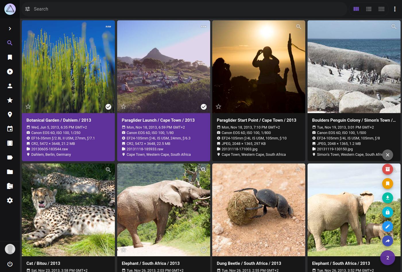
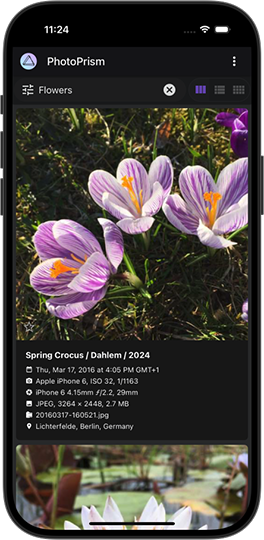
PhotoPrism® is an AI-powered, privacy-first app for browsing, organizing, and sharing photos and videos. It helps tag, search, and rediscover media without getting in your way, whether self-hosted or in the cloud.

To get a first impression, you are welcome to play with our public demo. Please be careful not to upload any private, unlawful or offensive pictures.

Feature Overview

Our mission is to provide the most user- and privacy-friendly solution to keep your pictures organized and accessible. That's why PhotoPrism was built from the ground up to run wherever you need it, without compromising freedom, privacy, or functionality:

Being completely self-funded and independent, we can promise you that we will never sell your data and that we will always be transparent about our software and services. Your data will never be shared with Google, Amazon, Microsoft or Apple unless you intentionally upload files to one of their services. 🔒

Getting Started

Step-by-step installation instructions for our self-hosted community edition can be found on docs.photoprism.app - all you need is a Web browser and Docker to run the server. It is available for Mac, Linux, and Windows.

The stable releases and development preview are available as a multi-arch image for 64-bit AMD, Intel, and ARM processors. That means, Raspberry Pi and Apple Silicon users enjoy the exact same functionality and can follow the same installation steps.

See our Getting Started FAQ for alternative installation methods, for example using the tar.gz packages we provide.

Support Our Mission 💎

PhotoPrism is 100% self-funded and independent. Your continued support helps us provide more features to the public, release regular updates, and remain independent!

Our members enjoy additional features, including access to interactive world maps, and can join our private chat room to connect with our team. We currently have the following membership options:

  • You can sign up directly on our website and pay with credit card or SEPA through Stripe, so you don't need to link an external account and can easily upgrade or downgrade at any time
  • Alternatively, Patreon also supports PayPal, additional currencies, and lets you choose between monthly and annual billing for all tiers

If you currently support us through GitHub Sponsors, you can also register on our website and use the Activate GitHub Sponsors Membership button to link your account. For details on this and how to link your Patreon account, see our Activation Guide.

You are welcome to contact us for change requests, membership questions, and business partnerships.

View Membership FAQ ›Sign Up ›

Why Your Support Matters

  • Your continued support helps us provide regular updates and remain independent, so we can fulfill our mission and protect your privacy
  • Sustained funding is key to quickly releasing new features requested by you and other community members
  • Being self-funded and independent, we can personally promise you that we will never sell your data and that we will always be transparent about our software and services

Please also leave a star on GitHub if you like this project. It provides additional motivation to keep going.

A big thank you to all current and past sponsors, whose generous support has been and continues to be essential to the success of the project!

View Sponsors ›View Credits ›

Getting Support

Visit docs.photoprism.app/user-guide to learn how to sync, organize, and share your pictures. If you need help installing our software at home, you are welcome to post your question in GitHub Discussions or ask in our Community Chat. Common problems can be quickly diagnosed and solved using our Troubleshooting Checklists. Eligible members are also welcome to email us for technical support and advice.

Upcoming Features and Enhancements

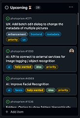
Our Project Roadmap shows what tasks are in progress and what features will be implemented next. You are invited to give ideas you like a thumbs-up, so we know what's most popular.

Be aware that we have a zero-bug policy and do our best to help users when they need support or have other questions. This comes at a price though, as we can't give exact release dates for new features. Our team receives many more requests than can be implemented, so we want to emphasize that we are in no way obligated to implement the features, enhancements, or other changes you request. We do, however, appreciate your feedback and carefully consider all requests.

Because sustained funding is key to quickly releasing new features, we encourage you to support our mission by signing up for a personal membership or purchasing a commercial license.

Become a Member ›

GitHub Issues ⚠️

We kindly ask you not to report bugs via GitHub Issues unless you are certain to have found a fully reproducible and previously unreported issue that must be fixed directly in the app. Thank you for your careful consideration!

Connect with the Community

Follow us on Mastodon, Bluesky, or join the Community Chat to get regular updates, connect with other users, and discuss your ideas. Our Code of Conduct explains the "dos and don’ts" when interacting with other community members.

As a contributor, you are also welcome to contact us directly if you have something on your mind that you don't want to discuss publicly. Please note, however, that due to the high volume of emails we receive, our team may be unable to get back to you immediately. We do our best to respond within five business days or less.

Every Contribution Makes a Difference

We welcome contributions of any kind, including blog posts, tutorials, translations, testing, writing documentation, and pull requests. Our Developer Guide contains all the information necessary for you to get started.

from  https://github.com/photoprism/photoprism

Friday, 10 July 2026

Voicebox, 全能的AI语音克隆神器在本地安装使用

 AI 配音领域,ElevenLabs 效果确实好,但订阅费贵,隐私合规风险也不小。Voicebox 是一个本地化的语音克隆工作室,完全隐私、开源免费,还有工业级的后期处理,算是 ElevenLabs 的最强平替。


核心优势

Voicebox 不只是一个文字转语音工具,更像是一个本地的专业语音制作流水线。所有模型和语音数据都存在本地,不用联网上传,没有版权和隐私的顾虑。用 Tauri(Rust)构建,跟那些臃肿的 Electron 架构不一样,响应速度很快。完美适配 macOS、Windows、Linux 以及 Intel Arc 等全平台。

核心功能

集成了 Qwen3-TTS、Chatterbox Turbo、Kokoro、HumeAI TADA 等主流引擎。支持 23 种语言,包括中文、英语、日语、阿拉伯语等。零样本几秒钟快速克隆,或者用 50 多种精选预设音色。内置音高变换、混响、延迟、合唱、压缩器及滤波器。支持 [laugh][sigh][gasp] 等情感标签。提供多轨道时间线,可以创作播客、叙事或多角色对话。

安装

  1. GitHub点击跳转


实操:三步搞定配音

第一步:准备参考音频。可以直接录制、上传本地文件,或者采集系统音频。

第二步:配置模型与克隆。输入文字,选合适的 TTS 引擎。


显存或内存配置低的话选 Turbo 或低配版本。选好后系统自动下载权重文件。

第三步:音频处理与导出。用多轨道时间线精修。点右上角的三点图标,选 Export Audio 导出。


API 与集成

Voicebox 是 API 优先的设计,提供完整的 REST API 接口。可以集成到 n8n 等自动化工作流或第三方应用中。

Monday, 6 July 2026

npmmirror.com

$ npm config set registry https://registry.npmmirror.com  (改为国内的镜像的registry)
$ npm config set registry https://registry.npmjs.com (改回了官方的registry) 
 https://npmmirror.com/

建站程序JeeSite


Java 低代码, 轻量级, Spring Boot, MyBatis, Flowable, TypeScript, Vue, Antdv, 包括核心模块如:组织机构、角色用户、权限授权、数据权限、内容管理、工作流、Spring Cloud 微服务等。

JeeSite Vue3 前端源码
使用 Turborepo、Monorepo、pnpm
快速构建、模块化、代码复用、高效管理

TypeScript-Vite8 Antdv-Next-Vue3 JeeSite-V5.x star star star star


如果你喜欢 JeeSite,请给她一个 ⭐️ Star,您的支持将是我们前行的动力。

  1. 单仓多包 pnpm + Turborepo 涡轮增压,提升编译速度,方便统一管理脚本任务
  2. 按功能模块进行拆分为不同的包,方便进行团队开发源码管理,可根据需要进行发包
  3. 模块之间松耦合,单依赖,公共模块,公共组件,公共工具,方便代码复用
  4. 可方便从传统架构版本,升级到 Monorepo 模块化、分包架构

技术交流

  JeeSite微信公众号

  • QQ群(已满):1275158762093304832235077187095342757303900921373527183903863(外包)
  • 微信群:如果二维码过期,请尝试点击图片并F5刷新,或者添加客服微信 jeesitex 邀请您进群

  JeeSite微信群

平台介绍

  • JeeSite 快速开发平台,低代码,轻量级,不仅仅是一个后台开发框架,它是一个企业级快速开发解决方案,后端基于经典组合 Spring Boot、Shiro、MyBatis,前端采用分离版 Vue3、Vite、TypeScript、Antdv Next、Vben Admin 最先进技术栈,或者 Beetl、Bootstrap、AdminLTE 经典开发模式。

  • 提供在线数据源管理、数据表建模、代码生成等功能,可自动创建业务模块代码工程和微服务模块代码工程,自动生成前端代码和后端代码;包括核心功能模块如:组织机构、用户、角色、岗位、管理员、权限审计、菜单及按钮权限、数据权限、模块管理、系统参数、字典管理、系统监控、数据监控等;扩展功能如:工作流引擎、内容管理、消息推送、单点登录、第三方登录、在线作业调度、对象存储、可视化数据大屏、报表设计器、在线文件预览、国际化、全文检索、统一认证服务等。

  • 本平台采用松耦合设计,真正的轻量级,微内核,快速部署,插件架构,模块增减便捷,支持扩展 SaaS 架构、集群部署、读写分离、分库分表、Spring Cloud 微服务架构;并内置了众多账号安全设置、密码策略、系统访问限制等安全解决方案,支持等保评测。

  • 本平台专注于为初级研发人员提供强大的支持,使他们能够高效、快速地开发出复杂的业务功能,同时为中高级人员腾出宝贵的时间,专注于更具战略性和创新性的任务。我们致力于让开发者能够全心投入业务逻辑中,而将繁琐的技术细节交由平台来封装处理。这不仅降低了技术实现的难度,还确保了系统架构的稳定性和安全性,进而帮助企业节省人力成本、缩短项目周期,并提高整体软件的安全性和质量。

  • 2013 年发布以来已被广大爱好者用到了企业、政府、医疗、金融、互联网等各个领域中,拥有:精良架构、易于扩展、大众思维的设计模式,工匠精神,用心打磨每一个细节,深入开发者的内心,并荣获开源中国《最受欢迎中国开源软件》多次奖项,期间也帮助了不少刚毕业的大学生,教师作为入门教材,快速的去实践。

  • 2019 年换代升级,我们结合了多年总结和经验,以及各方面的应用案例,对架构完成了一次全部重构,也纳入很多新的思想。不管是从开发者模式、底层架构、逻辑处理还是到用户界面,用户交互体验上都有很大的进步,在不忘学习成本、提高开发效率的情况下,安全方面也做和很多工作,包括:身份认证、密码策略、安全审计、日志收集等众多安全选项供您选择。努力为大中小微企业打造全方位企业级快速开发解决方案。

  • 2021 年终发布 Vue3 的前后分离版本,使得 JeeSite 拥有同一个后台服务 Web 来支撑分离版和全栈版两套前端技术栈。

  • 对接 OpenAPI、Ollama、DeepSeek 等热门 AI 大模型,凭借检索增强生成 RAG 技术,为企业知识库打造专属智能对话。

  • 提供大模型 Tool 本地工具调用及 MCP 服务端和客户端工具调用,助力大模型与您的业务深度融合,实现高效交互。

  • 支持国产化软件和硬件环境,如国产芯片、操作系统、数据库、中间件、国密算法等。

核心优势

  • JeeSite 非常易于二次开发,可控性强。整体架构清晰、技术栈稳定且先进,源代码规范严谨。所采用的均为业界通用、社区活跃的经典技术,经典技术会的人多、学习成本低、无论是维护还是扩展都十分便捷,系统安全性和稳定性也得到了充分保障。

  • JeeSite 功能全面,知识点非常多,也非常少。这看似矛盾,实则源于其“大道至简”的设计理念:功能模块和组件的设计,使用的都是一些通用的技术,通俗直观的设计风格,绝大多数开发者都能轻松掌握,所以只要掌握这些组件用法,即可高效完成业务系统的开发。

  • JeeSite 在架构设计、工具调用、操作体验、代码整洁、技术规范以及系统安全等方面投入了大量精力。这些往往属于“隐形投入”——虽然用户未必一眼可见,却对系统的稳定性、可维护性和长期发展至关重要。然而,许多产品更倾向于追求表面光鲜的界面和看似炫目的功能,不愿意在用户看不见的地方投入较多的研发经费,而忽视了这些深层次的基础建设。

  • JeeSite 是一个低代码开发平台,具备高度的封装性与出色的扩展能力。这里的“封装”并非限制您的自由,而是在提供开箱即用便捷性的同时,保留了充分的灵活性。当平台暂未覆盖某些特定功能时,JeeSite 会通过清晰的扩展接口和原生调用方式,让您轻松实现自定义需求。

  • 许多开发者都在使用 Spring 框架,并学习其优秀的设计理念——尤其是它强大的扩展机制。但试想一下:有多少人真正去修改过 Spring 的源码?即便有人这么做了,一旦框架升级,往往就会陷入兼容性困境,甚至导致系统难以维护。这样的例子屡见不鲜。

  • 正因如此,JeeSite 在设计之初就高度重视这一点:我们坚持“不侵入、可扩展”的原则,确保您在享受高效开发的同时,无需担心未来升级带来的麻烦。JeeSite 的扩展能力,正是为了帮您彻底摆脱这类后顾之忧。

  • 为什么说 JeeSite 比较易于学习?JeeSite 很好的把握了设计的 “度”,避免过度设计的情况。过度设计是在产品设计过程中忽略了产品和用户的实际需求,反而带来了不必要的复杂性,而忽略了系统的学习、开发和维护成本。

  • JeeSite 商业版基于社区版扩展,我们维护一套代码库,有效避免资源浪费和重复造轮子,不仅加速了功能迭代与优化、保障版本稳定性输出,还能快速反哺社区,推动创新与生态共赢,确保项目健康发展;即便您使用社区版,也无需担忧版本停滞及相关衍生问题。


  • 至今 JeeSite 平台架构已经非常稳定,我们持续升级,并不失架构的先进性。
  • JeeSite 精益求精,用心打磨每一个细节,界面 UI 操作便捷,体验性好。
  • JeeSite 是一个专业的平台,是一个可以让您,用着省心的平台。
  • 社区版基于 Apache License 2.0 开源协议,永久免费使用。

架构特点及安全方面的优势:https://jeesite.com/docs/feature/

Vue 前端简介

基于 Vue3、Vite、TypeScript、Antdv Next 和 Vben Admin 等前沿技术栈构建,本软件采用最先进的技术架构, 帮助初学者快速上手并融入团队开发。内置组织机构、角色用户、菜单授权、数据权限、系统参数等核心模块,结合强大的组件封装 与数据驱动视图设计,为微小、中大型项目提供开箱即用的解决方案和丰富的示例,助力高效开发。

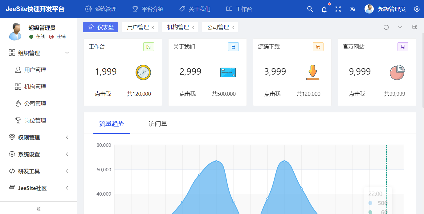
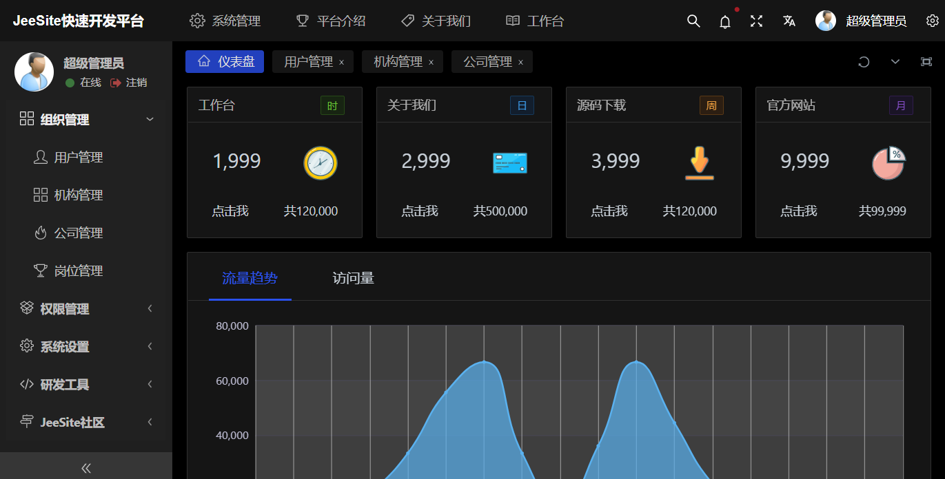
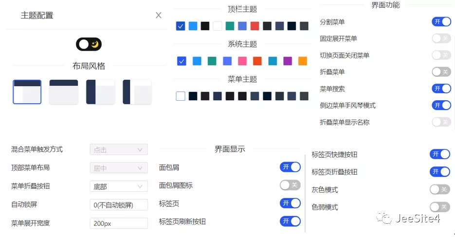
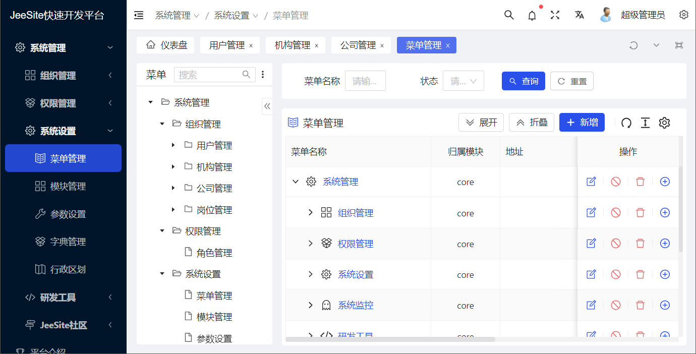
用户界面专为信息化管理后台量身打造,在界面设计上精益求精,每一处细节都彰显着精致,为用户带来优雅且直观的操作体验。 它提供多样化的菜单布局、智能的页签管理、高效的树表操作体验、强大的表格组件、灵活的表单组件设计,具备强大的扩展能力, 同时支持黑暗布局风格,为用户提供高效、灵活且美观的操作体验,满足各类管理后台的复杂需求。

支持 Turborepo + Monorepo 快速构建、模块化、代码复用、支持分包开发, 详见:https://gitee.com/thinkgem/jeesite-vue

前端技术特点

定义众多组件,非常贴心的组件属性及小功能,符合 JeeSite 以往的设计思想,列表和表单以数据驱动视图, 极大简化了业务功能开发, 注释分解详见【源码解析

为什么做数据驱动视图?前端向下兼容一直是最大的问题,有了一套相应的标准,会对框架升级帮助很大。 比如你可以非常小的成本,业务代码改动非常小的情况下,去升级前端;数据驱动视图可以为未来自定义拖拽表单做更好的铺垫, 数据存储结构更清晰化,更利于维护。

提示:请仔细阅读源码解析,表单视图和列表视图上的注释哦,支持复杂表单以及多表单联合使用。

学习准备

快速体验

在线演示

  1. 地址:https://vue.jeesite.com

快速运行

  1. 环境准备:Docker
  2. 根据您的操作系统,选择以下对应命令一键拉取 Docker 镜像并启动 JeeSite:
  • Linux 或 macOS
docker pull crpi-u3zm0t8trv68xpyx.cn-qingdao.personal.cr.aliyuncs.com/thinkgem/jeesite:latest && docker run --name js5 -p 8980:8980 -d -v ~/jeesite-data:/data crpi-u3zm0t8trv68xpyx.cn-qingdao.personal.cr.aliyuncs.com/thinkgem/jeesite:latest && docker logs -f js5
  • Windows
cmd /c "docker pull crpi-u3zm0t8trv68xpyx.cn-qingdao.personal.cr.aliyuncs.com/thinkgem/jeesite:latest && docker run --name js5 -p 8980:8980 -d -v %USERPROFILE%\jeesite-data:/data crpi-u3zm0t8trv68xpyx.cn-qingdao.personal.cr.aliyuncs.com/thinkgem/jeesite:latest && docker logs -f js5"

容器启动后,系统数据将持久化保存在本地 ~/jeesite-data(Linux/macOS)或 %USERPROFILE%\jeesite-data(Windows)目录中。

  1. Vue分离版本地址:http://127.0.0.1:8980/vue/login
  2. 全栈版本地址:http://127.0.0.1:8980/a/login
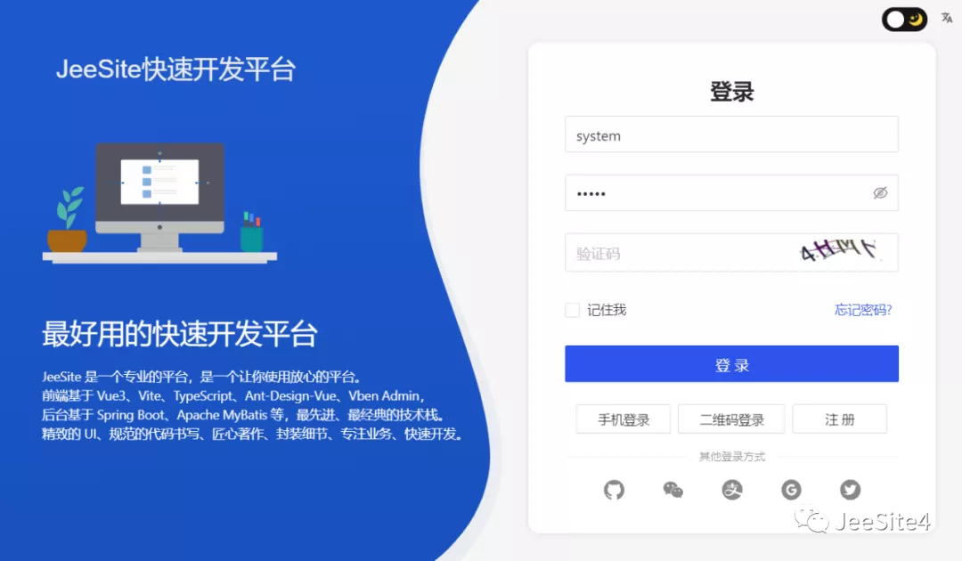
  3. 初始登录账号:(管理员)system,密码:admin

本地编译运行

# 验证
node -v
# 配置国内源
npm config set registry https://registry.npmmirror.com
  • 如果没有安装 Pnpm 执行安装
npm i -g pnpm
# 验证
pnpm -v
# 配置国内源
pnpm config set registry https://registry.npmmirror.com
  • 获取源代码
# 注意:不要在带有中文或空格的目录下执行。
git clone https://gitee.com/thinkgem/jeesite-vue.git
cd jeesite-vue
  • 安装依赖
pnpm install
  • 开发环境运行访问(方式一)
pnpm dev

开发环境会加载文件较多,便于调试,请耐心等待。

  • 编译打包后运行访问(方式二)
pnpm preview

编译打包后,会整合这些文件,所以访问性能会大大提高,生产环境可以开启 gzip

  • 打包发布程序
pnpm build

打包完成后,会在根目录生成 dist 文件夹,发布 nginx。

详见文档:https://jeesite.com/docs/vue-install-deploy/#部署到正式服务器

安装后端服务

# 代理设置,可配置多个,不能换行,格式:[访问接口的根路径, 代理地址, 是否保持Host头]
# VITE_PROXY = [["/js","https://vue.jeesite.com/js",true]]
VITE_PROXY = [["/js","http://127.0.0.1:8980/js",false]]

# 访问接口的根路径(例如:https://vue.jeesite.com)建议为空
VITE_GLOB_API_URL = 

# 访问接口的前缀,在根路径之后
VITE_GLOB_API_URL_PREFIX = /js

常见问题

  • Vue 版本的浏览器支持情况:支持所有现代浏览器,Vue3 已不再支持 IE 浏览器。
  • 为什么使用抽屉作为表单组件,因为抽屉空间更大,可以展示更多内容,且操作更友好。
  • 如何将表单抽屉改为弹窗,替换 list 和 form 页面的 Drawer 为 Modal 即可,V5.6增加了路由表单和弹窗表单的代码生成。
  • 打不开代码生成工具怎么办?提示 404,请检查 .env.development 中的代理配置 VITE_PROXY 最后一个参数(是否保持Host头),本地服务 127.0.0.1 应设置为 false,远程服务设置为 true。
  • 更多文档详见:https://jeesite.com/docs/vue-faq/#常见问题

如果需要低版本浏览器支持(如:Chrome 87)

请打开 .env.production 文件,设置参数后编译:

VITE_LEGACY = true

如果您使用的 VSCode 的话,推荐安装以下插件:

  • Volar - Vue3 开发插件(Vetur禁用)
  • Oxc - 质量检查、代码格式化(Oxlint、Oxfmt)
  • UnoCSS - 即时原子样式提示插件
  • Iconify - 图标库提示插件
  • I18n-ally - i18n 提示插件
  • ESLint - 脚本代码检查(使用 Oxc 替代)
  • Prettier - 代码格式化(使用 Oxc 替代)
  • Stylelint - CSS 样式文件格式化插件
  • DotENV - .env 文件高亮提示插件

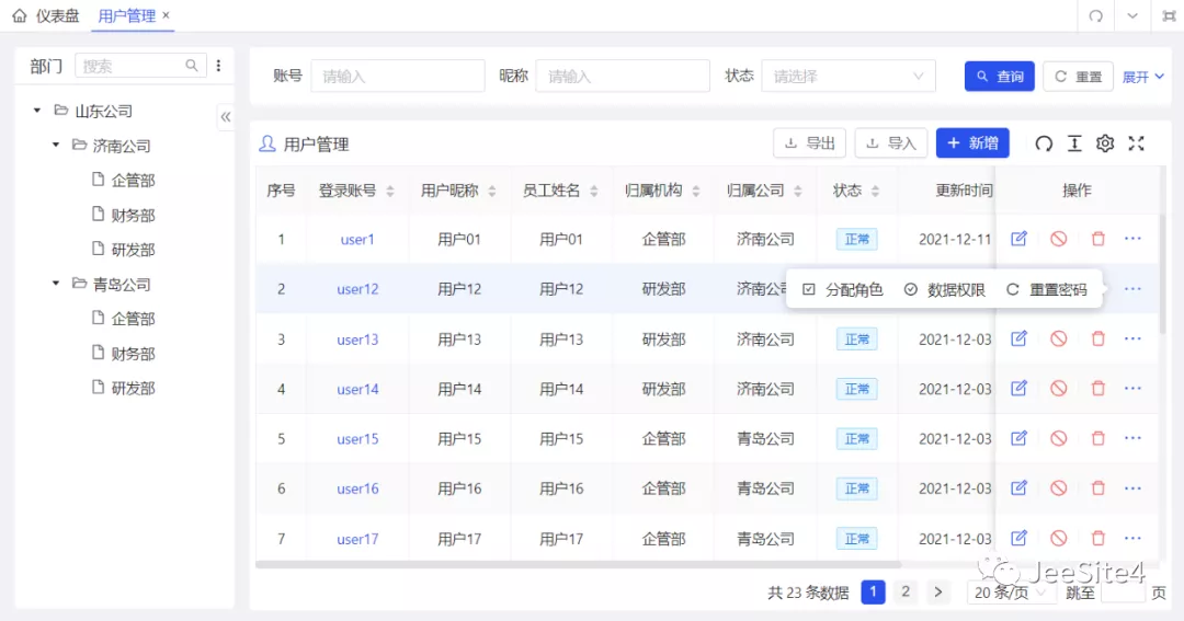
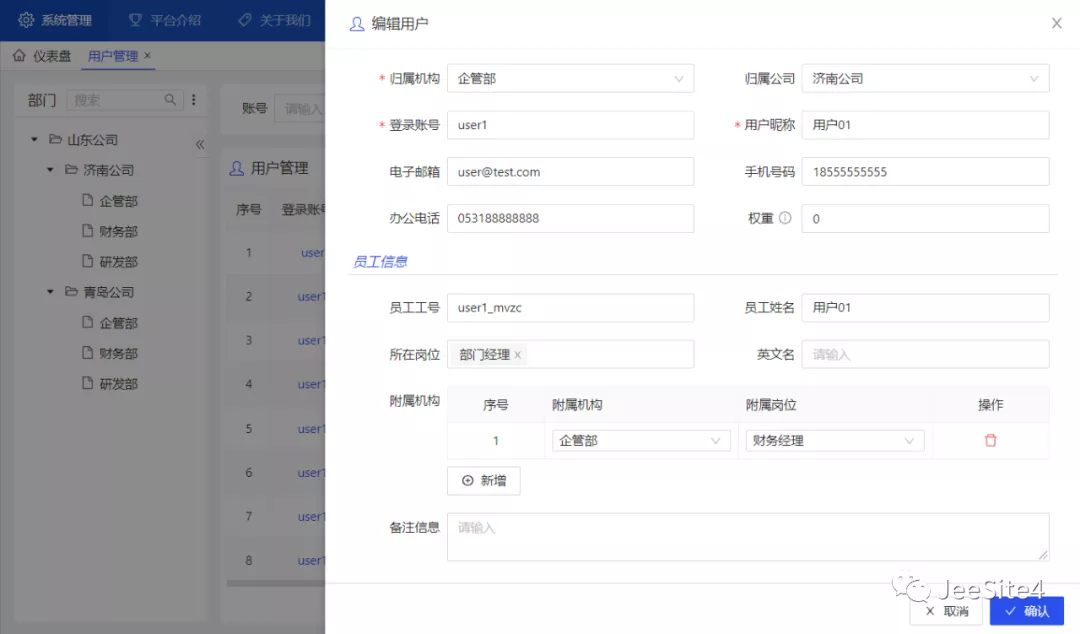
软件截图

附录

表单视图

<template>
  <!-- 弹出抽屉组件,如果想改为弹窗,Drawer 换为 Modal 即可快速替换 -->
  <BasicDrawer
    v-bind="$attrs"    -- 传递来自父组件的属性
    :showFooter="true" -- 显示弹窗底部按钮组
    :okAuth="'test:testData:edit'" -- 提交按钮权限,控制按钮是否显示
    @register="registerDrawer"     -- 弹窗后的回调方法
    @ok="handleSubmit" -- 提交按钮调用方法
    width="60%"        -- 弹窗宽度,支持按比例
  >
    <!-- 弹窗标题 -->
    <template #title>
      <Icon :icon="getTitle.icon" class="pr-1 m-1" /> -- 图标
      <span> {{ getTitle.value }} </span>  -- 标题名称
    </template>
    <!-- 表单组件 -->
    <BasicForm @register="registerForm">
      <!-- 定义表单控件插槽、个性化表单控件,如:这是一个表单子表插槽 -->
      <template #testDataChildList>
        <BasicTable
          @register="registerTestDataChildTable"
          @row-click="handleTestDataChildRowClick"
        />
        <!-- 子表新增按钮 -->
        <a-button class="mt-2" @click="handleTestDataChildAdd">
          <Icon icon="i-ant-design:plus-circle-outlined" /> {{ t('新增') }}
        </a-button>
      </template>
    </BasicForm>
  </BasicDrawer>
</template>
<!-- script name: 当前组件名称(与路由名一致,如果不一致会页面缓存失效)-->
<script lang="ts" setup name="ViewsTestTestDataForm">

  // 导入当前用到的对象,部分省略
  import { ref, unref, computed } from 'vue';
  import { officeTreeData } from '/@/api/sys/office';

  // 页面事件定义
  const emit = defineEmits(['success', 'register']);

  // 国际化方法调用,参数是国际化编码的根路径
  const { t } = useI18n('test.testData');

  // 消息弹窗方法
  const { showMessage } = useMessage();

  // 路由meta信息
  const { meta } = unref(router.currentRoute);

  // 当前页面数据记录
  const record = ref<Recordable>({});

  // 当前页面标题定义,来自菜单管理定义
  const getTitle = computed(() => ({
    icon: meta.icon || 'ant-design:book-outlined',
    value: record.value.isNewRecord ? t('新增数据') : t('编辑数据'),
  }));

  // 输入表单控件定义
  const inputFormSchemas: FormSchema[] = [
    {
      label: t('单行文本'), // 控件前面的页签
      field: 'testInput',  // 字段提交参数名
      component: 'Input',  // 控件类型(可自定义,更多查看 componentMap.ts )
      componentProps: {    // 组件属性定义
        maxlength: 200,
      },
      required: true,      // 表单验证,是否必填(快速定义)
      rules: [             // 如果不只是必填,需要通过 rules 定义,举例:
        { required: true },
        { min: 4, max: 20, message: t('请输入长度在 4 到 20 个字符之间') },
        { pattern: /^[\u0391-\uFFE5\w]+$/, message: t('不能输入特殊字符') },
        {
          validator(_rule, value) {
             return new Promise((resolve, reject) => {
              if (!value || value === '') return resolve();
              // 远程验证,访问后台校验数据是否重复
              checkTestInput(record.value.testInput || '', value)
                .then((res) => (res ? resolve() : reject(t('数据已存在'))))
                .catch((err) => reject(err.message || t('验证失败')));
            });
          },
          trigger: 'blur', // 如果是远程验证,可以减少请求频率
        },
      ],
      colProps: { lg: 24, md: 24 }, // 栅格布局(遵循 Ant Design 风格)
    },
    {
      label: t('下拉框'),
      field: 'testSelect',
      component: 'Select',    // 选择框还有 RadioGroup、CheckboxGroup
      componentProps: {
        dictType: 'sys_menu_type', // 下拉框选项数据(支持直接指定字典类型)
        allowClear: true,          // 启用空选项,可清空选择
        mode: 'multiple',          // 下拉框模块,启用多选
      },
    },
    {
      label: t('日期选择'),
      field: 'testDate',
      component: 'DatePicker',
      componentProps: {
        format: 'YYYY-MM-DD',      // 日期选择
        showTime: false,           // 关闭时间选择
      },
    },
    {
      label: t('日期时间'),
      field: 'testDatetime',
      component: 'DatePicker',
      componentProps: {
        format: 'YYYY-MM-DD HH:mm',    // 日期时间选择
        showTime: { format: 'HH:mm' }, // 设置时间的格式
      },
    },
    {
      label: t('用户选择'),
      field: 'testUser.userCode',
      fieldLabel: 'testUser.userName', //【支持返回,如下拉框或树选择的节点名】
      component: 'TreeSelect',         // 树选择控件
      componentProps: {
        api: officeTreeData,           // 数据源 API 定义,支持 ztree 格式
        params: { isLoadUser: true, userIdPrefix: '' }, // API 参数
        canSelectParent: false,        // 是否允许选择父级
        allowClear: true,
      },
    },
    {
      label: t('子表数据'),
      field: 'testDataChildList',
      component: 'Input',
      colProps: { lg: 24, md: 24 },
      slot: 'testDataChildList',      // 指定插槽、个性化控件内容
    },
  ];

  // 当前表单的参数定义
  const [registerForm, { resetFields, setFieldsValue, validate }] = useForm({
    labelWidth: 120,                  // 控件前面的标签宽度
    schemas: inputFormSchemas,        // 控件定义列表
    baseColProps: { lg: 12, md: 24 }, // 控件默认栅格布局方式(响应式)
  });

  // 当前表单子表格定义
  const [registerTestDataChildTable, testDataChildTable] = useTable({
    actionColumn: {  // 子表的操作列定义
      width: 60,     // 操作列宽度
      actions: (record: Recordable) => [
        {
          icon: 'i-ant-design:delete-outlined',
          color: 'error',
          popConfirm: { // 是否需要启用确认框
            title: '是否确认删除',
            confirm: handleTestDataChildDelete.bind(this, record),
          },
          auth: 'sys:empUser:edit',  // 按钮权限(可控制按钮是否显示)
        },
      ],
    },
    rowKey: 'id',     // 子表主键名
    pagination: false,// 关闭分页
    bordered: true,   // 开启表格边框
    size: 'small',    // 单元格间距
    inset: true,      // 是否内嵌(去除一些边距)
  });

  // 当前表单子表自动定义
  async function setTestDataChildTableData(_res: Recordable) {
    testDataChildTable.setColumns([
      {
        title: t('单行文本'),
        dataIndex: 'testInput',
        width: 230,
        align: 'left',
        editRow: true,          // 是否启用编辑
        editComponent: 'Input', // 编辑控件(可自定义,更多查看 componentMap.ts )
        editRule: true,         // 控件验证(是否必填)
      },
      {
        title: t('下拉框'),
        dataIndex: 'testSelect',
        width: 130,
        align: 'left',
        dictType: 'sys_menu_type',   // 指定字典类型,自动显示字典标签
        editRow: true,
        editComponent: 'Select',
        editComponentProps: {        // 控件属性
          dictType: 'sys_menu_type', // 下拉框的字段类型
          allowClear: true,
        },
        editRule: false,
      },
      // 更多组件控件不举例了,同表单控件 ...
    ]);
    // 设定子表数据
    testDataChildTable.setTableData(record.value.testDataChildList || []);
  }

  // 点击行,启用编辑
  function handleTestDataChildRowClick(record: Recordable) {
    record.onEdit?.(true, false);
  }

  // 添加编辑行,可指定初始数据
  function handleTestDataChildAdd() {
    testDataChildTable.insertTableDataRecord({
      id: new Date().getTime(),
      isNewRecord: true,
      editable: true,
    });
  }

  // 删除编辑行方法
  function handleTestDataChildDelete(record: Recordable) {
    testDataChildTable.deleteTableDataRecord(record);
  }

  // 获取子表数据(支持返回删除未提交的数据)
  async function getTestDataChildList() {
    let testDataChildListValid = true;
    let testDataChildList: Recordable[] = [];
    for (const record of testDataChildTable.getDataSource()) {
      // 验证控件内容,并取消行的编辑状态(如果验证失败返回false)
      if (!(await record.onEdit?.(false, true))) {
        testDataChildListValid = false;
      }
      testDataChildList.push({
        ...record,
        id: !!record.isNewRecord ? '' : record.id,
      });
    }
    for (const record of testDataChildTable.getDelDataSource()) {
      if (!!record.isNewRecord) continue;
      testDataChildList.push({
        ...record,
        status: '1',
      });
    }
    // 子表验证事件,抛出异常消息
    if (!testDataChildListValid) {
      throw { errorFields: [{ name: ['testDataChildList'] }] };
    }
    return testDataChildList;
  }

  // 弹窗后的回调事件,进行一些表单数据初始化等操作
  const [registerDrawer, { setDrawerProps, closeDrawer }] = useDrawerInner(async (data) => {
    resetFields(); // 重置表单数据
    setDrawerProps({ loading: true }); // 显示加载框
    const res = await testDataForm(data); // 查询表单数据
    record.value = (res.testData || {}) as Recordable;
    setFieldsValue(record.value);  // 设置字段值
    setTestDataChildTableData(res);  // 设置子表数据(没有子表可不写)
    setDrawerProps({ loading: false }); // 隐藏加载框
  });

  // 表单提交按钮方法
  async function handleSubmit() {
    try {
      const data = await validate(); // 验证表单,并返回数据
      setDrawerProps({ confirmLoading: true }); // 显示提交加载中
      // 设置提交的参数(QueryString,后台 Controller 的 get 接受)
      const params: any = {
        isNewRecord: record.value.isNewRecord,
        id: record.value.id,
      };
      // 获取并设置子表数据
      data.testDataChildList = await getTestDataChildList();
      // console.log('submit', params, data, record);
      // 将数据提交给后台(如果失败跳转到 catch)
      const res = await testDataSave(params, data);
      showMessage(res.message); // 显示提交结果
      setTimeout(closeDrawer);  // 隐藏抽屉弹窗
      emit('success', data);    // 触发事件,列表数据刷新
    } catch (error: any) {
      if (error && error.errorFields) {
        showMessage(t('您填写的信息有误,请根据提示修正。'));
      }
      console.log('error', error);
    } finally {
      setDrawerProps({ confirmLoading: false }); // 隐藏提交加载中
    }
  }
</script>

列表视图

<template>
  <div>
    <!-- 表格组件 -->
    <BasicTable @register="registerTable">
      <!-- 表格标题插槽 -->
      <template #tableTitle>
        <Icon :icon="getTitle.icon" class="m-1 pr-1" />
        <span> {{ getTitle.value }} </span>
      </template>
      <!-- 表格右侧按钮插槽,其中 v-auth 是按钮权限控制 -->
      <template #toolbar>
        <a-button type="primary" @click="handleForm({})" v-auth="'test:testData:edit'">
          <Icon icon="i-fluent:add-12-filled" /> {{ t('新增') }}
        </a-button>
      </template>
      <!-- 首列插槽 -->
      <template #firstColumn="{ record }">
        <a @click="handleForm({ id: record.id })">
          {{ record.testInput }}
        </a>
      </template>
    </BasicTable>
    <!-- 点击表格行进入的输入表单弹窗 -->
    <InputForm @register="registerDrawer" @success="handleSuccess" />
  </div>
</template>
<!-- script name: 当前组件名称(与路由名一致,如果不一致会页面缓存失效)-->
<script lang="ts" setup name="ViewsTestTestDataList">

  // 导入当前用到的对象,部分省略
  import InputForm from './form.vue';

  // 国际化方法调用,参数是国际化编码的根路径
  const { t } = useI18n('test.testData');

  // 消息弹窗方法
  const { showMessage } = useMessage();

  // 路由meta信息
  const { meta } = unref(router.currentRoute);

  // 当前页面标题定义,来自菜单管理定义
  const getTitle = {
    icon: meta.icon || 'ant-design:book-outlined',
    value: meta.title || t('数据管理'),
  };

  // 表格搜索表单控件定义
  const searchForm: FormProps = {
    baseColProps: { lg: 6, md: 8 }, // 表单栅格布局
    labelWidth: 90,                 // 表单标签宽度
    schemas: [
      {
        label: t('单行文本'),        // 表单标签
        field: 'testInput',         // 字段提交参数名
        component: 'Input',         // 表单控件
      },
      {
        label: t('下拉框'),
        field: 'testSelect',
        component: 'Select',    // 选择框还有 RadioGroup、CheckboxGroup
        componentProps: {
          dictType: 'sys_menu_type', // 下拉框选项数据(支持直接指定字典类型)
          allowClear: true,          // 启用空选项,可清空选择
          mode: 'multiple',          // 下拉框模块,启用多选
        },
      },
      // 更多控件,再次不展示了,和上一节表单视图一致
    ],
  };

  // 表格列定义
  const tableColumns: BasicColumn[] = [
    {
      title: t('单行文本'),    // 表头标题
      dataIndex: 'testInput', // 表列实体属性名
      key: 'a.test_input',    // 排序数据库字段名
      sorter: true,           // 点击表头是否可排序
      width: 230,             // 列宽
      align: 'left',          // 列的对齐方式
      // 个性化列,可定义插槽(如样式,增加控件等)
      slot: 'firstColumn',
    },
    {
      title: t('下拉框'),
      dataIndex: 'testSelect',
      key: 'a.test_select',
      sorter: true,
      width: 130,
      align: 'center',
      dictType: 'sys_menu_type', // 字典列,快速显示字典标签
    },
  ];

  // 表格操作列定义
  const actionColumn: BasicColumn = {
    width: 160, // 操作列宽
    actions: (record: Recordable) => [
      {
        icon: 'i-clarity:note-edit-line',
        title: t('编辑数据'),
        onClick: handleForm.bind(this, { id: record.id }),
        // 按钮权限控制,指定权限字符串
        auth: 'test:testData:edit',
      },
      {
        icon: 'i-ant-design:stop-outlined',
        color: 'error',
        title: t('停用数据'),
        // 是否需要启用确认框
        popConfirm: {
          title: t('是否确认停用数据'),
          confirm: handleDisable.bind(this, { id: record.id }),
        },
        // 按钮权限控制,指定权限字符串
        auth: 'test:testData:edit',
        // 控制按钮是否显示(区别:show 是显示或隐藏;ifShow 是显示或移除)
        show: () => record.status === '0',
        ifShow: () => record.status === '0',
      },
    ],
    // 操作列更多按钮定义
    dropDownActions: (record: Recordable) => [
      {
        icon: 'i-ant-design:reload-outlined',
        label: t('重置密码'),
        onClick: handleResetpwd.bind(this, { userCode: record.userCode }),
        auth: 'sys:empUser:resetpwd',
      },
    ],
  };

  // 点击首列或编辑按钮是的抽屉弹窗定义
  const [registerDrawer, { openDrawer }] = useDrawer();

  // 表格定义
  const [registerTable, { reload }] = useTable({
    api: testDataListData,     // 表格数据源 API
    beforeFetch: (params) => {
      return params;           // API 提交之前的参数修改
    },
    columns: tableColumns,     // 表格列
    actionColumn: actionColumn,// 操作列
    formConfig: searchForm,    // 搜索表单
    showTableSetting: true,    // 是否显示右上角的设置按钮
    useSearchForm: true,       // 是否显示搜索表单
    canResize: true,           // 是否自适应表单高度
  });

  // 弹窗操作方法
  function handleForm(record: Recordable) {
    openDrawer(true, record);
  }

  // 操作列停用按钮方法
  async function handleDisable(record: Recordable) {
    const res = await testDataDisable(record);
    showMessage(res.message);
    handleSuccess();
  }

  // 刷新表格数据(含表单回调)
  function handleSuccess() {
    reload();
  }
</script>

更多介绍

产品列表

学习文档

分离版

经典版

更多文档